When this service fits
- You need a portal or product used regularly by staff or customers
- You need a clear journey for requests, bookings, or follow-up
- You already have something basic and need a cleaner structure
Web applications
We start from the main screens and daily workflow, then build an interface that supports the goal directly.
Custom web interfaces for bookings, requests, tracking, internal use, or focused operational flows.
Teams that need a clear interface instead of scattered messages, sheets, and manual steps.
Related work
Full-stack e-commerce / 2026
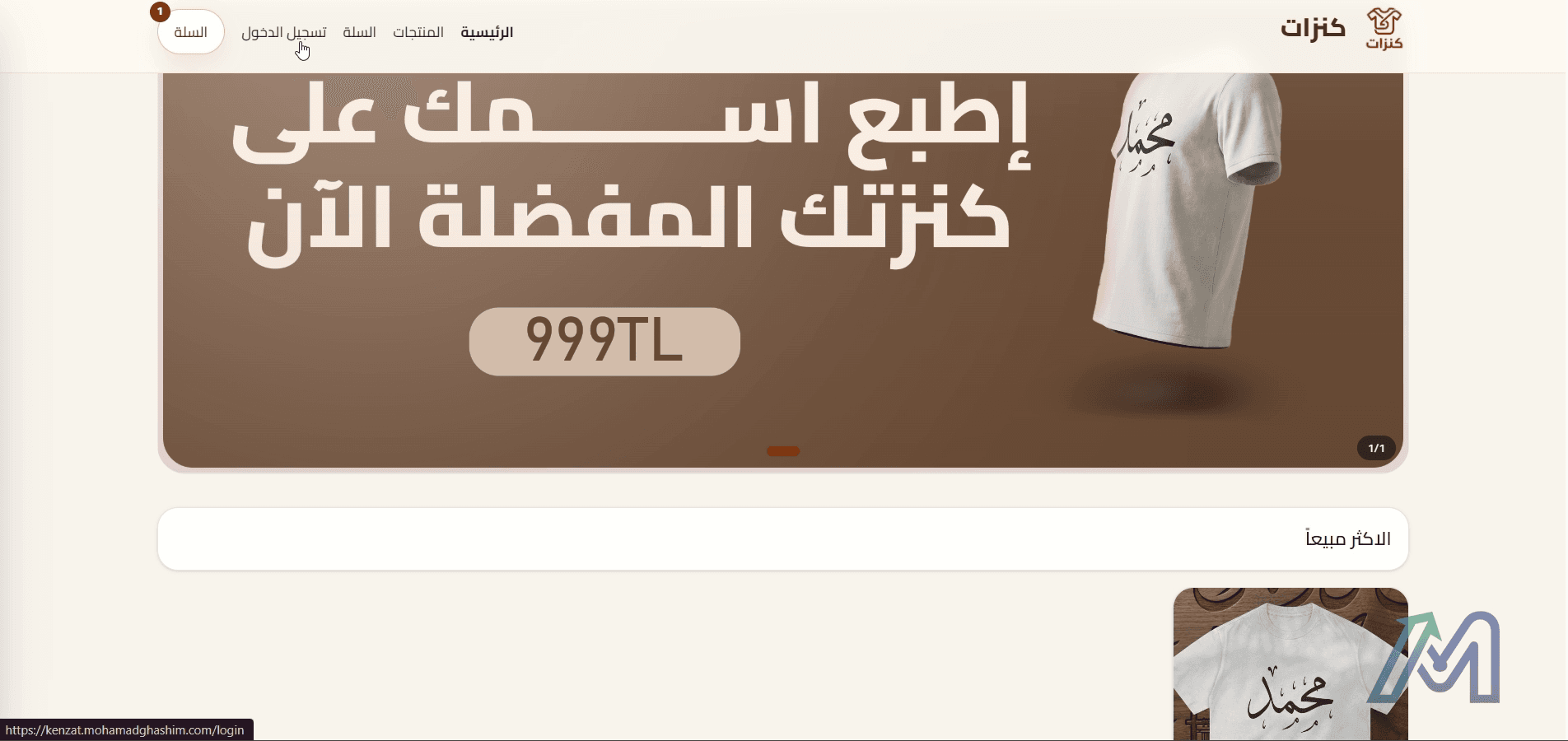
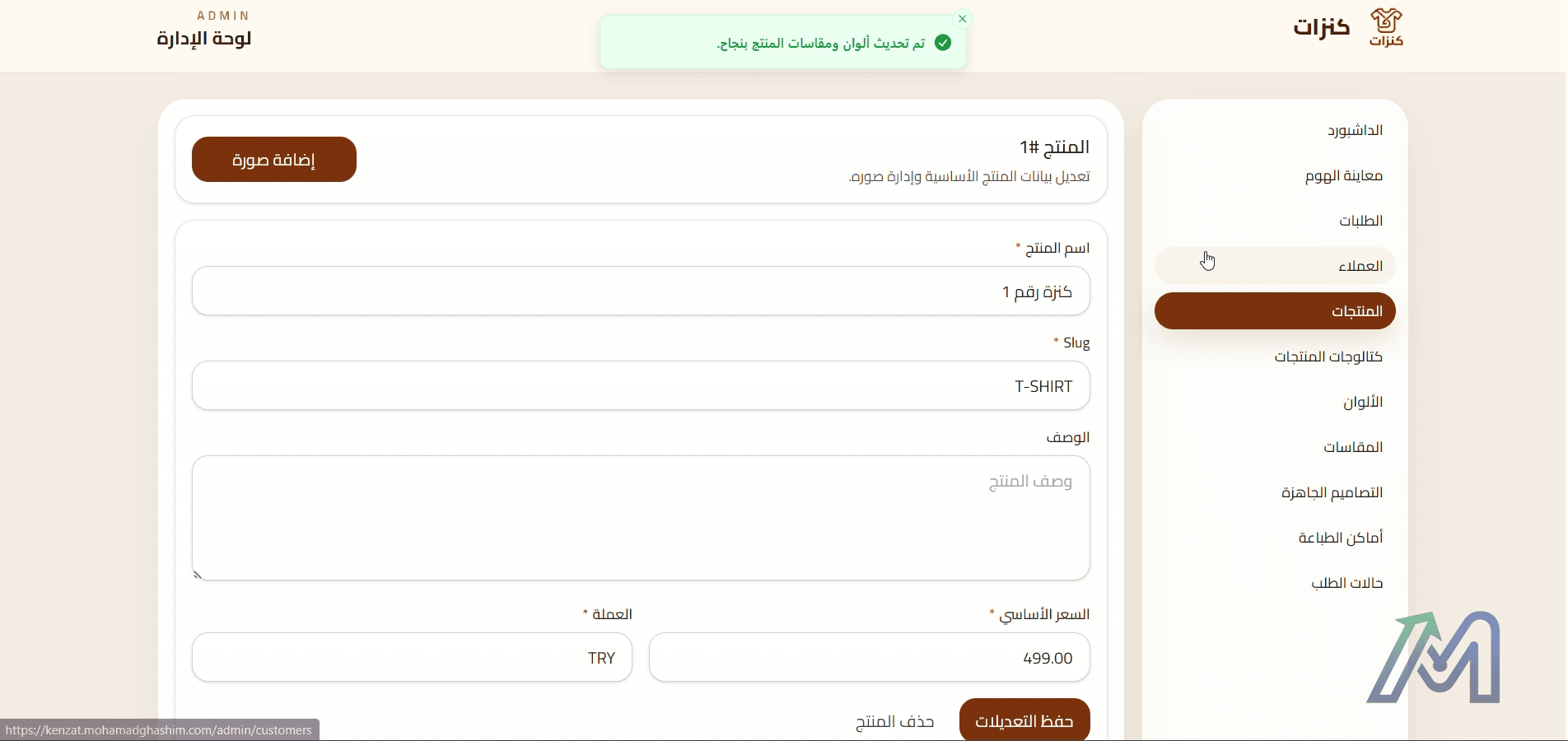
Kenzat is an Arabic storefront with product customization, cart flow, user accounts, and an admin area for products, designs, sizes, print positions, and orders.
The project needed more than a product listing page. The store had to manage customizable product data and let the owner update catalog details without touching code.
Laravel API + React storefront + admin dashboard
The important part was treating the product as structured data, not as a static page. That made the admin dashboard useful for real changes after delivery.
Screen capture from the product walkthrough
The available recording shows product selection, customization details, and admin-side changes.
01:00
Full-stack internal system / 2026
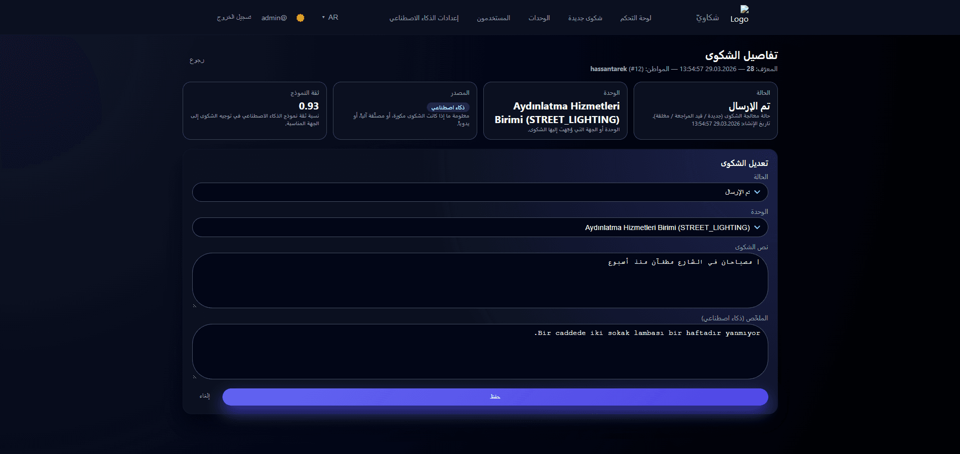
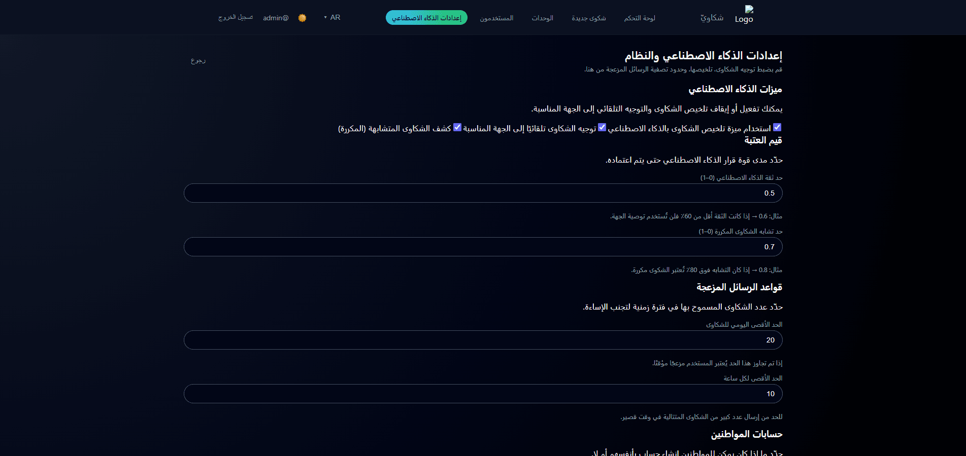
A smart Arabic complaints system with admin dashboard, user roles, service departments, complaint routing, AI summaries, duplicate detection, and configurable AI settings.
Complaint follow-up becomes difficult when requests increase and several departments are responsible for different cases.
React frontend + Django REST API + AI-assisted workflow
The useful part of AI here is not replacing the admin. It is helping with routing and summaries while the system keeps the decision visible.

Published case-study screenshot
No separate local recording was found for this project, so the media uses the published portfolio screenshots.
Case asset
Send the main task the interface needs to handle and we will suggest the best starting scope.